25+ Hard-to-Ignore Real Estate Logos For Inspiration In 2022
It’s given that your business logo is the definitive identity of your brand. Whenever you market your properties, create content, and talk about business, that small thumbnail design speaks to the organization you represent.
The importance of visual design communication has been repeated many times – to increase conversion, communication, brand awareness, and how your audience perceives your business. The brand logos are difficult to forget. People may forget about your website or tagline, but the logo struck differently. When you see the apple with a bite icon or a yellow “m” on a red surface, you immediately know which brand it is.
Likewise, your logo should lead your brand identity in the real estate business. If you’re currently in the process of building your site or revamping it, maybe, then this article is perfect for you.
We’ve listed out the 25+ hard-to-ignore real estate logos for you to get inspiration from.
25+ Best Real Estate Logos of 2022
1. Michael Gourkani
Michael Gourkani’s logo is simple, easy to remember, yet designed with class and luxury. It’s minimalist with style on it. The logo also exudes confidence from the buyers.

2. Smith & Robert Realty
The design is very symmetric and also exudes a feeling of “we’ve got the right home for you here.” It’s not a complicated design, and people can immediately recognize the business type once they see the logo.

3. Thirty Park Place
Just like Michael’s, Thirty Park Place also exudes luxury. If you’re going to be a luxury agent selling huge valued properties, this logo inspiration is the best for that.

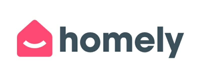
4. Homely
Homely got the vibe of being playful and friendliness to its clients. It’s simple, straightforward, and exudes great customer service. This is best for general real estate agents selling average prices homes.
5. RealScout
RealScout doesn’t hurt eyes. What the audience would probably love about this logo is that it’s neutral and pretty straightforward yet already communicated its message that the business is indeed — selling homes.

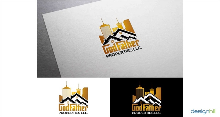
6. GodFather Properties LLC
It is agreeable that GodFather’s logo design and colors scream power, luxury, and authority. Plus, its name – it’s beautifully curated.
7. North Stream
If you don’t have that much of a budget for a logo, this is a perfect inspiration. Although it’s simple, it exudes elegance and confidence, especially with neutral colors.
8. 7th Street
Just two words: smooth and powerful.

9. Link Realty
Link Realty’s logo is elegant and easy to remember. However, it might not be immediately recognizable if it’s just the logo; maybe you can tweak it a bit by adding a small house figure on the side.

10. Gregg Lynn
What the people like about Gregg Lynn’s logo is its elegance and simplicity which represents the modern real estate business.

11. Carbo Cribs
You’ll never go wrong with the simplicity and playfulness of Carbo Crib’s logo.
12. Hilton & Hyland
The logo is power itself. It’s best to get inspiration from if you have another real estate partner.
13. Properties Direct
The design emphasizes the rooftop and gives the impression of a growth chart. Customers’ passion and energy in purchasing a home are evoked by the color red.

14. Chateau Orleans
The design is classic yet still knows how to close deals compared to some of its modern design counterparts.
15. House of Hawley
The House of Hawley gives a perception of a very welcoming real estate agent because of how big its gates are. It’s simple and elegant.
16. One Street
Two words again to best describe One Street’s logo: timeless and attractive.

17. Williams & Williams
Williams & Williams’ logo concept is perfect for luxury real estate agents — stylish and gold.
18. Focus Fulfillment
It’s obvious that the two letters “Fs” in the logo are shaped like a rooftop. It’s pretty smart and attractive.
19. XCellence Realty
The logo is unique, and it denotes “moving forward” for both the real estate agents and their clients.

20. Elmington
The logo has three prisms, and it means they offer services other than the typical real estate, such as commercial, investment, and housing. Their white and gray color combinations give them the perception of stability essential in the real estate market in terms of color psychology.

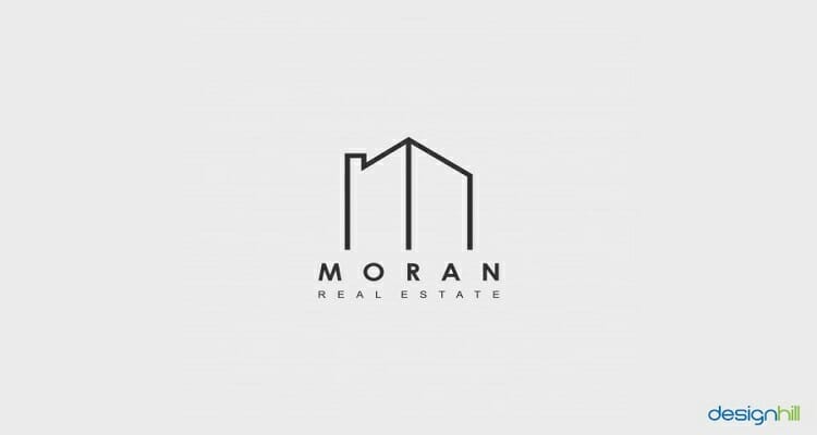
21. Moran Real Estate
With the right, artistic design of lines, the Moran Real Estate logo has powerfully communicated its message. It’s minimalist and evokes elegance.
22. Jullian Pillarski
The monogram’s design is exquisite, unique, and eye-catching. Perhaps, the strong point of this concept is its overall synchronization with the words and line arts.

23. Here’s a house
It’s a great design that’s playful and denotes conversation.

24. Michael Beeman
If you want your name to be your own business brand identity, tweaking it with some obvious design concept will make it stand out.

25. Denver Real Estate Professionals
This business logo is the one that knows how to get your attention. It is eye-catching and straightforward, with a color palette that we can’t get enough of.

26. Novak Solutions
Novak Solutions’ provides another modern logo that is minimalist and effective in communicating its intent.

Also Read: 25+ Clever Real Estate Lead Generation Ideas for 2022

