10+ Best Modern Real Estate Branding Examples
The key to the perfect modern real estate branding is the synchronization of designs, colors, and highly marketable copywriting without sounding like hard selling.
Additionally, the website should be easy to navigate, responsive, has a great layout, and filled with high-value content.
If you’re wondering which modern real estate branding we are talking about here, this article is perfect for you, especially if you’re currently rebranding your website and overall brand identity.
Here are the top 10 best modern real estate branding examples to get inspiration from:
1. Solomon Property Group
Solomon Property Group is easy to navigate, and the layout is very user-friendly. Its video background on the hero page makes it as if you’re buying in person because it denotes like giving you a tour. The header is complete, and the customer just got everything they need on the homepage. Moreover, its color combination, as well as the content, are perfectly in sync, which makes it look more elegant and professional.

2. The Fields Team
You can already tell why it’s very modern with just one look. Its layout and design are just perfect – not too bland and colorful. The whole website is also user-friendly and just got all you need with one quick navigation.

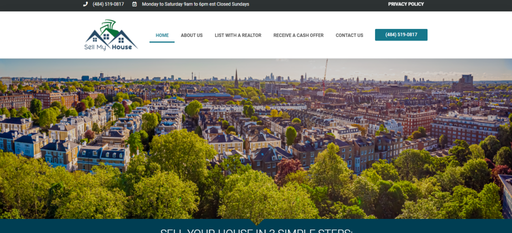
3. Sell My House
Pretty straightforward and professional. There’s no need for all those fancy designs and features. It’s just perfect for real estate agents who primarily go with selling houses. Aside from that, the procedure is clear, as well as the CTAs. If there’s a question on the client’s side, it would just be very minimal.

4. For Utah Real Estate
When you scroll down the bottom, it’s obviously information-packed. However, its design and layout are perfect. A round of applause on its footer, too, for quick navigation around the web pages.

5. Andrew Plank
Andrew Plank’s website is the epitome of professionalism and credibility. It’s easy to navigate, pretty straightforward, and information-packed without it looking overloaded. Additionally, it also has a great layout and plus points on its background video on the hero page, as well as its useful resources on the blog tab.

6. Aspen
Very modern and elegant. This could have been perfect for real estate agents selling luxury homes without those typical black and gold color combinations. Its main strength when it comes to features would probably be the accurate filters. Overall, it’s a great color choice that screams stability.

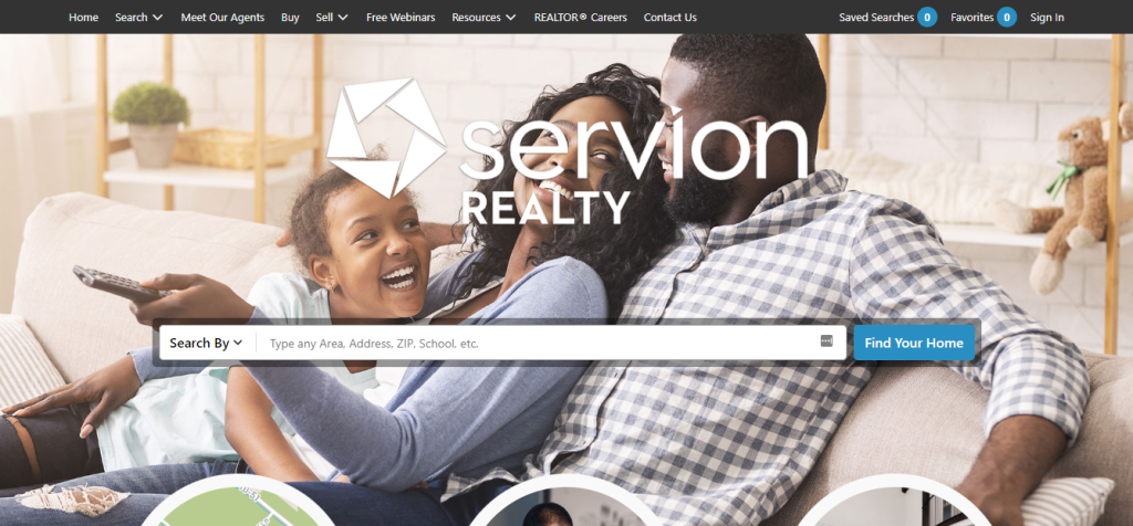
7. Servion Realty
If you prioritize functionality and easy navigation, this kind of layout is perfect. With just one or two minutes of scrolling through the hero page, you’ll immediately learn what type of real estate business they’re prioritizing. We’d say, plus 100 points on its marketing data and specificity of property listings.

8. Ariel
Ariel is another one of the branding design concepts from Placester. Great copywriting, and it screams a modern design. It’s simple, clean, and highly organized. This is perfectly fit for minimalist real estate agents.

9. Christ Lacharity
Christ Lacharity’s website can be summed up in three words: power, luxury, and authority. Obviously, this type of branding concept is best suited for luxury real estate agents who are experts in their fields and masters in negotiations. It has a great color combination, layout, and fonts.

10. Hadden Homes
Great visuals at first glance and never boring. It also has a perfect color combination that evokes femininity and luxury. Its layout emphasizes its achievement. Thus their brand evokes credibility all over. Their main strength would be neatness and being organized and presentable.

Also Read: 7+ Best Real Estate Website Builders This 2022


