Tips for Designing Eye-Catching Real Estate Posters Using Canva Templates

Eye-catching real estate posters are an excellent introduction to your brand. Fortunately, even with zero graphic design experience, Canva templates enable you to create designs that catch the eyes and help you engage with your target audience.
To help you grab the attention of people scrolling through their social feeds or passers-by, we’ve compiled these tips for designing eye-catching real estate posters using Canva templates.
Tip 1: Highlight Key Selling Points
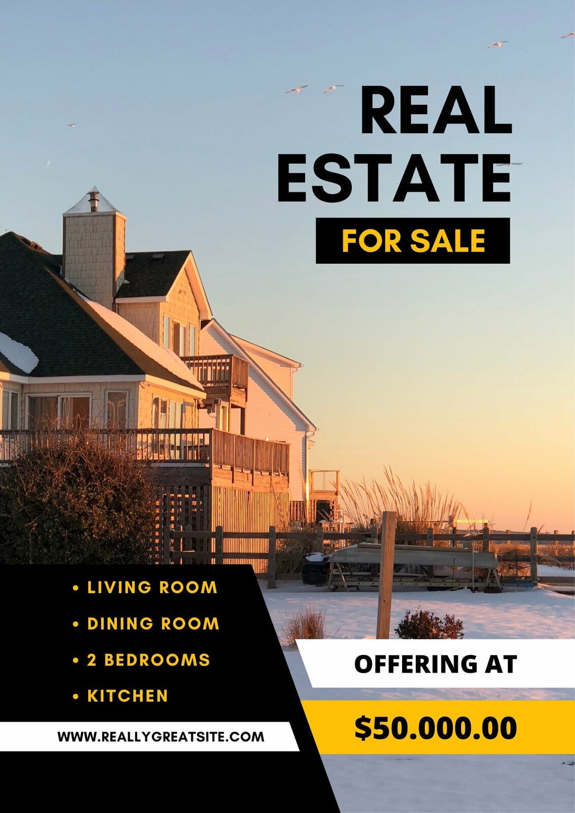
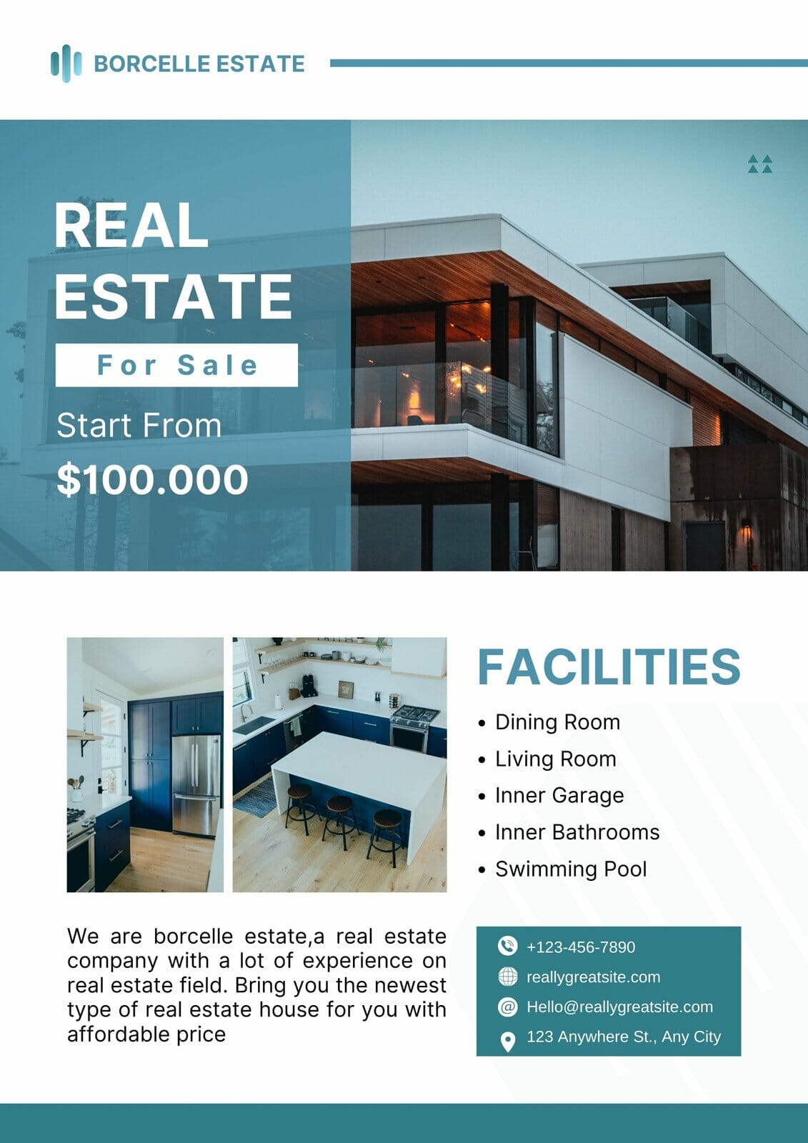
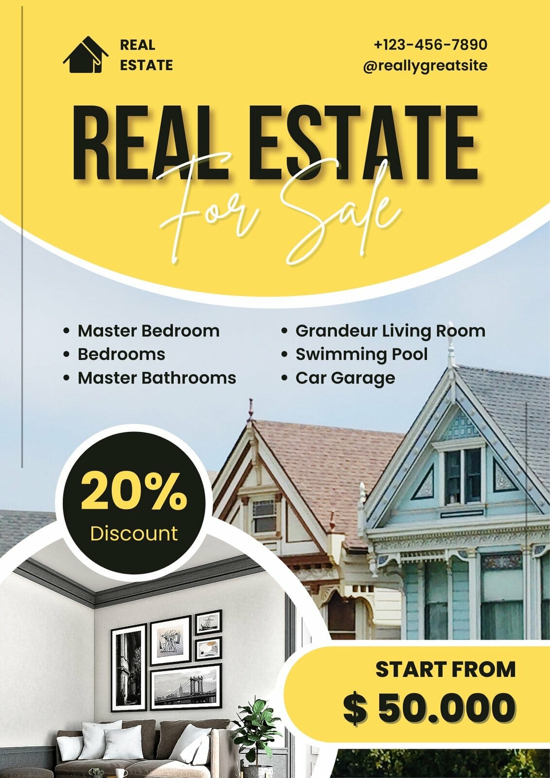
Successful real estate posters immediately communicate the property’s main selling points to the viewers. Once you’ve identified the property’s attractive features, like unique amenities, spacious interiors, or a beautiful view, ensure they take center stage in your design.
Tip 2: Use Contrasting Colors and Bold Color Overlays

If you want to elicit a mood and create energy, contrasting colors, and bold color overlays can help you with that goal. Additionally, you can use background images, ensuring the texts are legible on top of them. This makes your poster eye-catching and more accessible for those with low vision.
Tip 3: Consider Interesting Shapes

Canva offers many shapes, vectors, and images to make your posters more attractive. You can use circles, stars, rectangles, or triangles to draw attention. Also, experiment with various shapes in a variety of colors.
Tip 4: Embrace White Space
Another pro tip when designing your poster is to avoid overcrowding your poster with too much text and graphics. White space gives your design room to breathe and enhances readability. It also delivers a sense of sophistication to your poster.
Tip 5: Play with Layering

Creating depth and dimension on your poster is easy with proper layering. As you overlap and layer different design elements, you can provide an improved 3D experience for your viewers. Canva allows you to send elements to the front, back, forward, and backward to make the layering easier.
Tip 6: Use Complementary Fonts
Font style is another critical design element; we recommend choosing at least two. Ideally, you must stick to one simple font and one highlight font. For example, you can use Raleway as your simple font and Playlist Script as your highlight. Moreover, make your highlight font bigger.
Tip 7: Incorporate Creative Illustrations and On-Brand Photos

Using photography on your real estate posters allows you to show your brand’s personality. You can use a property listing shot, an illustration of your team, or your real estate agency logo to represent your brand and spice up your poster. You can check out our customizable templates if you still have no real estate logo.
Tip 8: Add a Call to Action
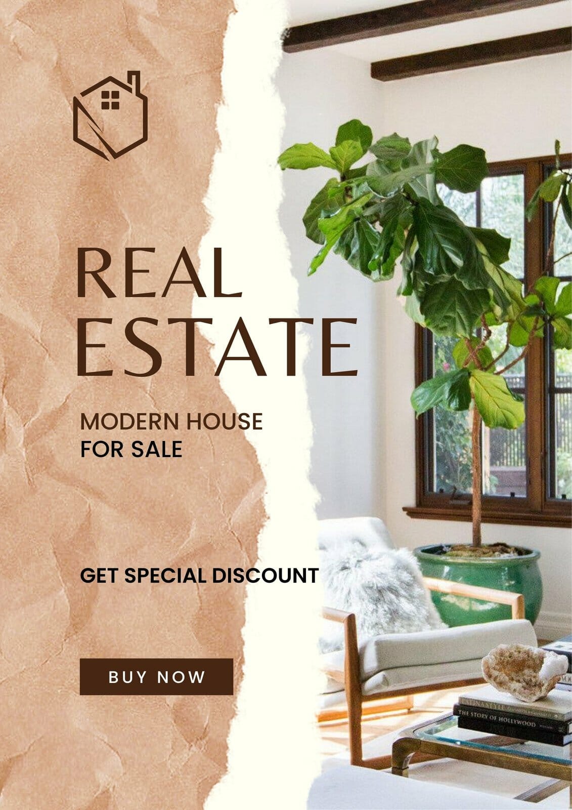
A compelling CTA motivates viewers to take the next step. Ensure it is clear, concise, and stands out in the design. This helps your eye-catching posters become effective, too. You can also use design elements like arrows or buttons to direct attention toward the CTA.
Real estate posters attract new clients, get them to sign up for your newsletters or events, drive people to visit your website, or convince them to purchase a property from your listing. And your poster design should attractively and accurately represent your real estate business. With expert tips above, you’re ready to design visually striking and effective posters that leave a lasting impression.
References: